
Jolly’s Old-Fashioned
Teas Cream
What Makes Jolly’s?
Jolly's Old-Fashioned Teas Cream is a boutique ice cream parlor that specializes in tea-flavored ice cream presented in an artfully crafted way.
The ice cream is made locally with the freshest ingredients and a balance of flavors that will entice even those who are not great tea drinkers.
The market for locally crafted ice cream is quite high and today's consumers are looking for new dessert experiences.
Ice creams like chocolate smoke and earl grey tea will appeal to the bubble tea-loving crowd and to those looking for a high-quality ice cream.


Visual Identity
OVERVIEWJolly’s Old-Fashioned Teas Cream Visual Identity takes inspiration from the packaging design from the late 1800s, classic ice cream parlors of yesteryear, and tea houses from around the world. The brand takes a modern graphic twist on these creative influences through typography, color, photography, iconography, and natural textures.


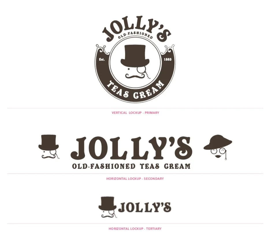
Making A Brand
LOGO DESIGNThe Jolly’s Old-Fashioned Teas Cream logo comes in three pre-built lockup variants—one vertical and two horizontal.
The primary default lockup is vertical and should be used wherever possible, specifically where space is not a constraint. The secondary horizontal lockup is intended to be used when displaying the Jolly’s Old-Fashioned Teas Cream logo in tighter spaces. The tertiary horizontal logo is intended to be used when displaying the full Jolly’s Old-Fashioned Teas Cream logo is rendered too small to be impactful. Never modify the relationship or scale of elements in any of the lockups.
The Color of Yum
COLOR PALETTEThe Jolly’s Old-Fashioned Teas Cream system uses a sophisticated palette of color that takes its cues from tea and classic ice cream flavors. Jolly‘s brown 100 is the primary brand color and may be applied liberally in conjunction with the white or the primary greens and neutral palette.
The accent and secondary palettes are meant to be used in moderation, specifically Jolly‘s orange, which should be used sparingly and never dominate more than 5% of the palette.
When designing well-balanced layouts for the Jolly’s Old-Fashioned Teas Cream Brand, there are occasions when large areas of saturated color may be appropriate. However, most business communications, web properties, and presentations should take advantage of roughly 40% white space.

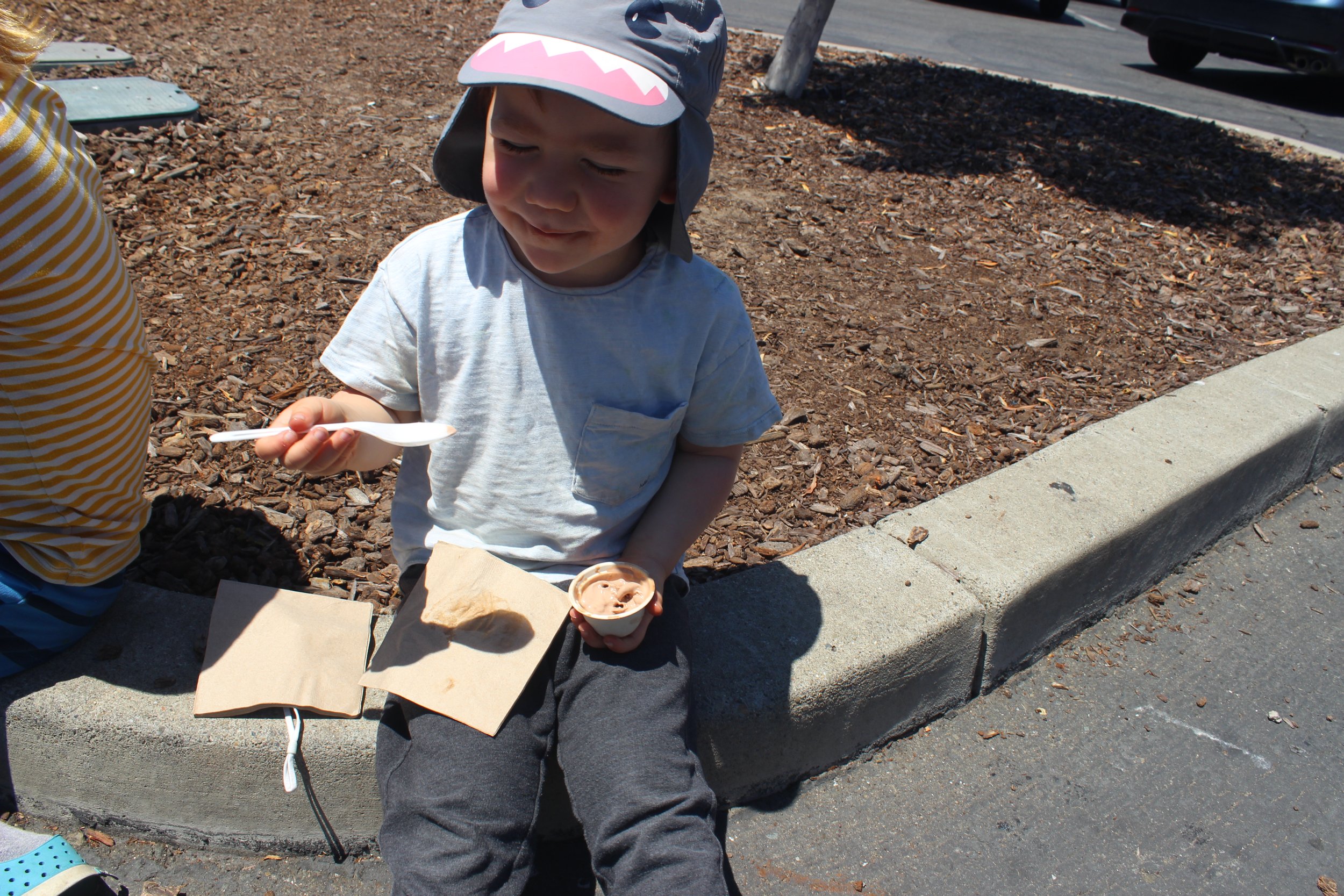
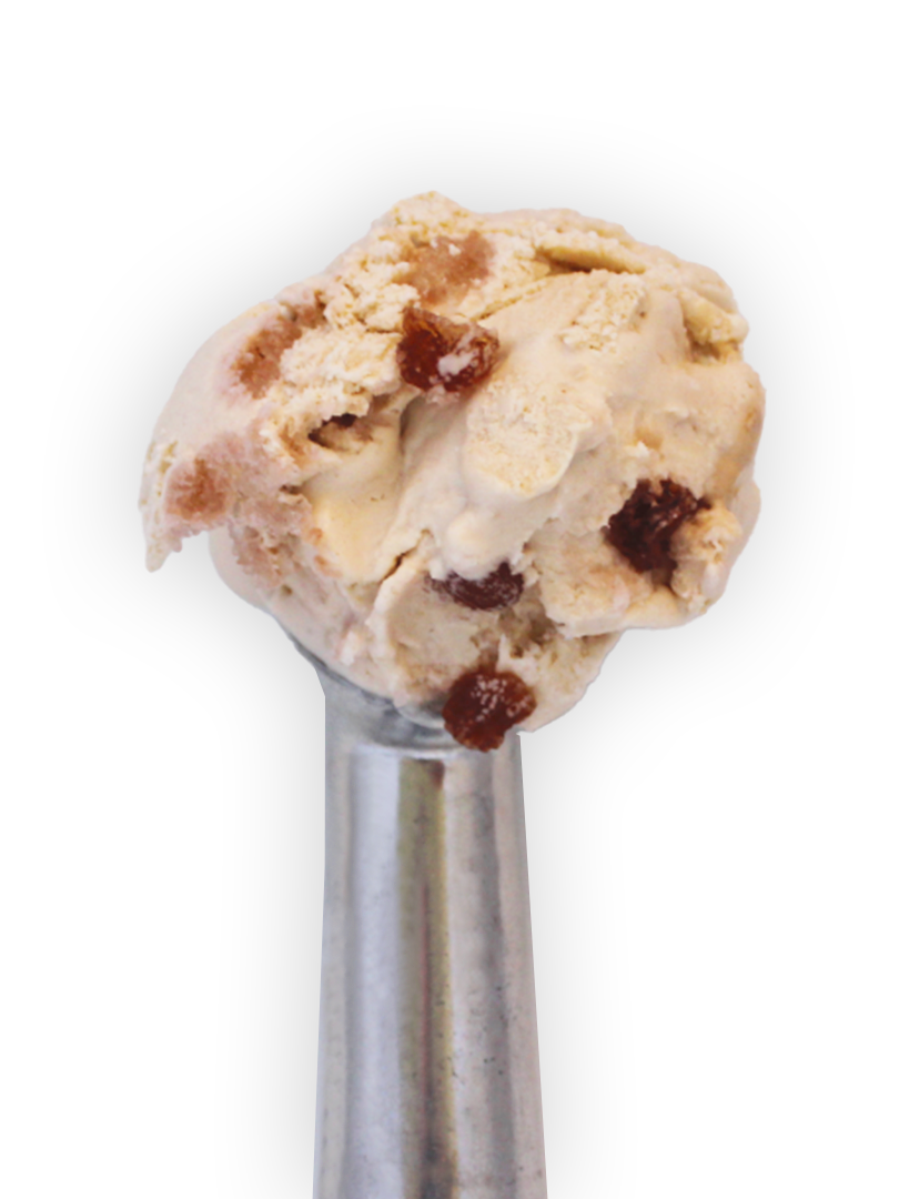
Ice Cream Life
PHOTOGRAPHY STYLEJolly’s Old-Fashioned Teas Cream brand photography falls into two categories—brand content and menu imagery.
For brand content, images should have a natural and not too posed quality. This uses natural light and color in the photography.
Menu imagery is always the item isolated on a white background. For ice cream flavors, the scoop color needs to look as close as possible to the actual color of the flavor.


Web Design

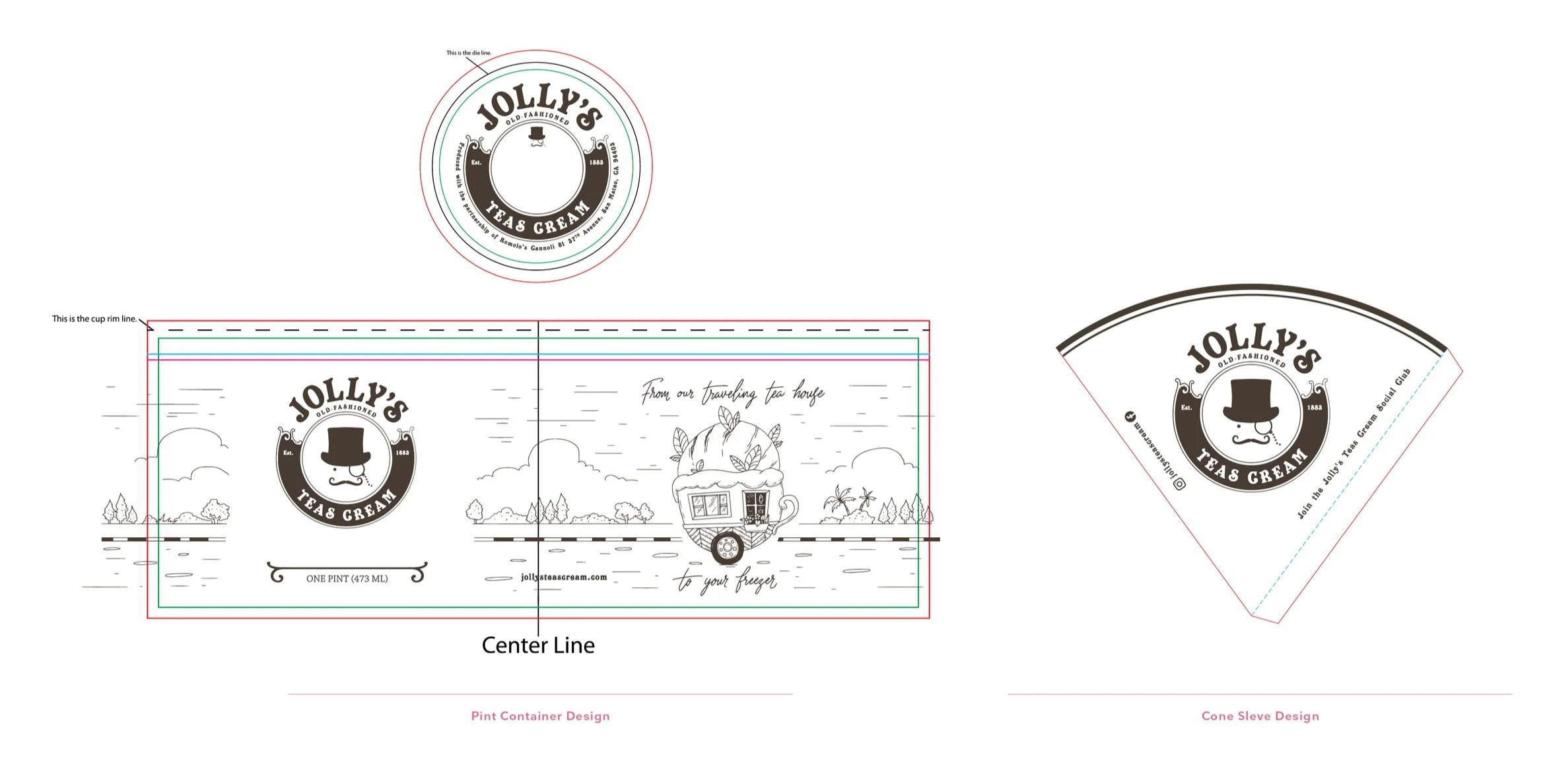
Pint Containers & Cone Sleves
Business Cards

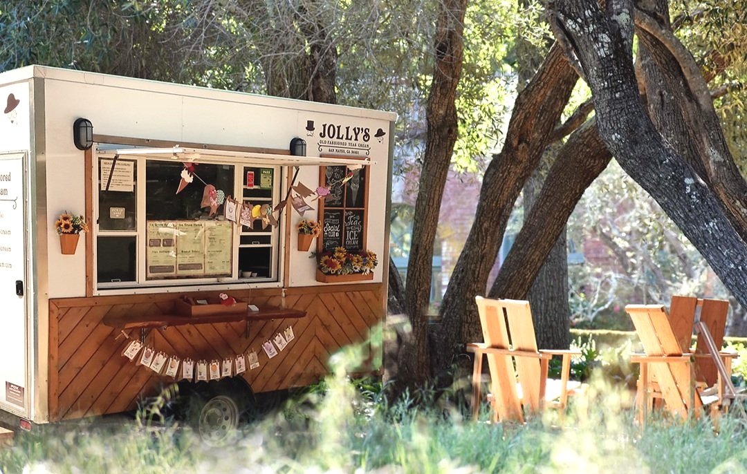
Trailer Design & Graphics

The Trailer
Creative Director: Vanessa Greene
Writer: Vanessa Greene
Art Director: Vanessa Greene
Designer: Vanessa Greene
Producer: Vanessa Greene